March 7, 2014Responsive Web Design (RWD) is based on cutting edge technology that intelligently adjusts (versus merely shrinks) its layout, images and navigational features based on how it’s being viewed.
“Our clients are on-the-go, results-oriented people. They take care of business wherever and whenever it calls for their attention…on-site, on-the-road, at home or in the office. When we built our new website it made sense to invest in responsive design technology. It scales automatically to the device at hand – from smart phones and tablets to laptops and large desktop screens, which makes for easy viewing and navigating. Our job, as engineering partners, is to make our client’s job easier, on all fronts. This was simply a good fit.” Christopher Crozier, P.Eng., Principal, Crozier & Associates
What is Responsive Web Design?
May 8, 2013 by Annie Pilon In Technology Trends 61
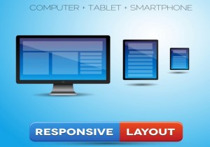 Responsive Web design is an approach whereby a designer creates a Web page that “responds to” or resizes itself depending on the type of device it is being seen through. That could be an oversized desktop computer monitor, a laptop, a 10-inch tablet, a 7-inch tablet, or a 4-inch smartphone screen. Responsive Web design has become one of the hottest trends in 2013. This is due in part to the growth of smartphones and other mobile devices. More people are using smaller-screen devices to view Web pages. In fact, Mashable even dubbed 2013 the Year of Responsive Web Design. Pete Cashmore wrote, “For those of us who create websites and services, all this leads to a singular conclusion: A million screens have bloomed, and we need to build for all of them.”
What Does Responsive Web Design Look Like?
The purpose of responsive design is to have one site, but with different elements that respond differently when viewed on devices of different sizes. Let’s take a traditional “fixed” website. When viewed on a desktop computer, for instance, the website might show three columns. But when you view that same layout on a smaller tablet, it might force you to scroll horizontally, something users don’t like. Or elements might be hidden from view or look distorted. The impact is also complicated by the fact that many tablets can be viewed either in portrait orientation, or turned sideways for landscape view. On a tiny smartphone screen, websites can be even more challenging to see. Large images may “break” the layout. Sites can be slow to load on smartphones if they are graphics heavy. However, if a site uses responsive design, the tablet version might automatically adjust to display just two columns. That way, the content is readable and easy to navigate. On a smartphone, the content might appear as a single column, perhaps stacked vertically. Or possibly the user would have the ability to swipe over to view other columns. Images will resize instead of distorting the layout or getting cut off. The point is: with responsive design, the website automatically adjusts based on the device the viewer sees it in.
 Print
Print
|
Back to News


